Your cart is currently empty!
TpT How To: Enhance Your Products for Increased Traffic and Sales
This is Part One of a three-part series about setting up your Teachers Pay Teachers product pages. You can find Part Two here, and Part Three here.
First of all, let’s clarify a term. “Product Pages,” at least for our purposes here, are the pages where teacher-authors include information such as copyright, terms of use (TOU), thank you for your purchase, TpT Credits info, etc.
After posting a TpT dashboard image on Facebook from my TpT shop (similar to the one below), there was an outpouring of questions and curiosity about linking products within product pages, how that worked, etc. So I decided it would be beneficial to my fellow TpT’ers to expand on that with this post and the two subsequent ones. This specific post is an overview of what I include and why. The next post goes into linking, the third post covers video and preview info that is included in product listings.
If you notice, lines 6 – 9 cite “policy pages” as a traffic source. I have always called my initial product pages, policy pages because I started out with JUST having copyright and TOU in them (obviously I have expanded on that which is why we are here). So, the terms are interchangeable in my opinion. Anyhoo, you can see that the traffic source is VERY specific. I know exactly which product of mine brought this traffic to my store. Knowing this information is SO helpful! With this knowledge, I know what is converting sales, where to focus my energy, what to promote for best results, etc.
For example, “Not Like Any Other Day” (line 6) is the number one selling item in my store. I made it over four years ago and haven’t touched it since, but I’ve made thousands of dollars from it. The person that bought it, clicked on a link either to my store or to a product in my store from in the product pages of “Not Like Any Other Day.” This resulted in a 50% conversion rate which means of the 2 click-throughs, one of them purchased a product. A 50% conversion rate is epic. So what do I include in my product pages to get a 50% conversion rate…?
Let’s look at an overview of the product pages the customer sees:
First Group of Images:
I begin with image 1A, thanking the customer for their purchase and include my social links. I always include my email subscription link in there as well as a link to my website. 1B is the terms of use and a link to the TpT Credits info. I think it is important to note that the TpT Credit info may change over time, so I make sure that rather than me providing the specific info, the customer goes directly to the source. All I do is let them know it exists and is a benefit to them. I have no idea if anyone ever clicks the TpT Credit link, but I do get reviews. I’ve heard people say they never get reviews, so you may want to include this.
1C is a prime chance to shamelessly showcase some hand-picked reviews as well as remind customers to be social (again). Don’t be afraid to repeat yourself. When a rushed teacher is only skimming all of these pages on their way to the product, you kind of need to hammer them over the head with the important stuff.
Second Group of Images:
Images 2A and 2B are the money makers. These are what I have started calling my catalog pages and these are where the traffic comes from that was noted in the dashboard. The second post in this series will go into detail on these two pages specifically. 2C is where I put new info like the fact that I started a podcast. I also, again, have my social links and the link to my email for subscribing.

I have also started including samples of other products as a single page ad basically. The ad has a cover image of the product, a few words that describe it like “85 journal page freebie.” The image to the left is one example. Another is making a freebie that is designed specifically for the lesson they purchased, but can also be used more broadly. This ad also works as an image for Pinterest, to include in a TikTok or IG Reel… There’s no reason you have to make a thousand different images for all of the places we promote our products. I honestly try to create as few images as possible. And an ad like this can get reused forever. It is not seasonal or grade specific.
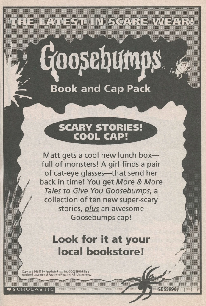
This particular ad is actually just a sample of a much larger, 230 page, resource I made. When the customer clicks on it, it will take them to my email sign-up page. They subscribe and when they open this freebie, they get all of my product pages (again) plus the freebie, and a link to the larger resource. So, if they like the freebie, they are likely to buy the larger resource. I got this idea from an old Goosebumps book I have. It has an ad in the back of it which I’ve always kind of enjoyed having in books. They are fun to look back on. But really, you have a captive audience, so you may as well use that opportunity.
In Conclusion:
To get more info on linking and tracking those links, go to the second post in this series. You can reach out to me with questions and comments here. I also love being social, so lets connect on Facebook, TikTok, or Instagram!

In case you like to geek out over books from our childhoods like I do, this website somehow collected images of all the Goosebumps in-book ads. I still remember how insanely excited I got when that Scholastic catalog came out…. Whew! I would pour over it again and again. During the school year I would get to pick one or two books each time, but at the end of the school year my mom would let me go hog wild, hoping all the books would keep me occupied over summer. Of course she underestimated how voracious of a reader I was lol. We still had to go to the library regularly.
Thank you for reading! I hope you find these posts helpful!


